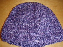
So, here's the yarn I started with:
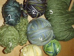
I'm terrible at estimating yarn requirements, so I figured I'd use #3 for my main color (it's Knitpicks Alpaca something, and I had nearly a full skien), double stranding it with the rest one at a time, going from dark to light starting at the brim (2, 1, 4, 5, 7, 6)
As it turned out, I only needed 1, 2 and part of 4 (plus most of 3).
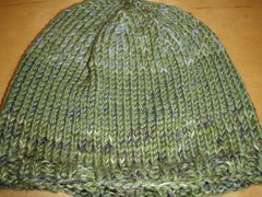
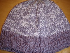
I cast of 72 sts, knit in 2x2 rib for 4 or 5 rows, switched to stockinette and knit straight till the hat was tall enough that the opening was a little bit smaller than my hand when the brim covered my ears (this is clearly not at exact process), the started decreasing every other row.
Since there were 72 sts, I worked the decrease rows as k7, K2tog all around, then a plain row, then k6, k2 tog, all around, then a plain row, then K5... etc. Once I for to K3, K2tog I stopped knitting the plain rows between and decreased every row till I was just K2toging the while time. Then I broke the yarn, threaded it back it through the live stitches and pulled it tight.
Then I did it several more times:
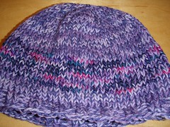
Those last 2 hats really are different--see the variegated purple/blue/pink strip?
4 comments:
I like the way you've played with the colors in putting your hats together. They are so much more interesting than a single color, which is what I'd probably do.
Your sweater jacket in the previous post looks great on you!
What a great idea!!! I love the different colors in with the main color to give it contrast or add a little something in it.
Love the green one. Those changing greens together- even of they look differnt in person- are wonderful!
omg i have been trying to make hats with leftover yarn but somehow the colors are not looking good together no matter how i mix them up: for example- coral, hot pink, and dusty raspberry = barf. I'm trying to narrow the color range and see if it's any better.
-Katy
Post a Comment