I told Laura about the knit-along when we met at Rhinebeck (that would be Laura from Schaefer Yarns), so the package she sent a couple of weeks ago included some Heather yarn for that project.
This one is definitely slated for socks. They've asked the designers to have someone test knit the pattern, so I'm going to use another of the skeins for that.

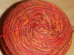
I just can't decide which one, because I'm suddenly very excited about knitting fair isle (mittens or a hat, nothing gigantic) from monochromatic handpainted yarn, and I think the blue/green and one of these browns would be great for that! What I can't tell (since I've only knitted fair isle once before, and that was with solid yarn), is whether I want the 2 colors to have the same amount of internal variation or not.
I mean, since the blue/green skein is both blue and green, would the pattern read better if I used the the brown on the left (actually brown and a very brown kind of pumpkin), or the one on the right (shades of the same brown)? Clearly, I will need to swatch. Maybe I will even take pictures of my swatches, as well as the (now finished) socks I designed and the shawl/blob I'm working on for my sister.
2 comments:
What will really make a difference in how it reads is the value contrast between the two yarns as you move through the color variations. (Value being the relative lightness or darkness; imagine seeing it in black and white.)
You lost me at Fair Isle.
Post a Comment